https://searchenginewatch.com/2018/06/11/using-the-new-google-adwords-dashboard/
Back in 2012, Lisa Raehsler wrote an article on 6 Super Time-Saving Tips to AdWords PPC Management, in which she presented some of the new time-saving features of AdWords. In the last 6 years, there have been many changes to the AdWords dashboard and a revolution in the other tools and software you can use to save time when managing your account(s).
You can now use a combination of the following techniques/features:
- Functionality within the main AdWords dashboard
- Features in the shared library within your AdWords account
- Creating and using a My Client Center account (MCC) for managing multiple accounts
- Other Google tools such as Google Editor (3), AdWords App and Google Data Studio
- Use of third party scripts, tools and software (free and paid).
This article will just focus on how to save time by using the features and functionality of the AdWords dashboard, though some of these features may also be available at the MCC level.
Time-saving functionality within the AdWords dashboard
The updated AdWords dashboard was rolled out through the later months of 2017. During this process, many features were gradually moved across from the old dashboard. Currently, it is still possible to switch between the old and new interface; however, the old dashboard is expected to be retired by the end of 2018.
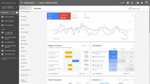
The new dashboard (shown above) has received a mixed response from long-time users. However, it does have the advantage of some new functionality, which was added in the first half of 2018, such as:
- To provide better insight and analysis for users (e.g. the new Overview Tab)
- The incorporation of machine learning or functionality to automate and speed up a lot of routine tasks (e.g. the new Recommendations Tab, which replaces Opportunities in the previous dashboard).
The time-saving functionality can be divided into three areas:
- Displaying and analysing data
- Creating and/or editing campaign elements
- The Recommendations Tab.
Displaying and analyzing data
Using the new Overview sheet for insights
The new Overview tab replaces the old Home tab. It has a number of summary cards, each with a link allowing you to click through to more information.
The cards are based on information that Google thinks will be useful, rather than saved filters from your account, which were used to create the old Home tab. The cards are also more graphical than the tabular data of the old Home tab.
Here are examples of cards from the new Overview tab, with data taken from a number of different accounts.
| Summary graph by date with four main metrics (each one can be added to the graph): | |
| Unusual activity today, e.g. increases or decrease in clicks
| Biggest changes – increases and decreases with the ability to choose from 10 metrics, e.g. cost or conversions |
| Campaigns – summary in a table with cost, clicks and CTR
| Search keywords – summary table with cost, clicks and CTR (you can choose from a total of 12 metrics for each column) |
| Search terms (or words) – search term n-gram with the ability to hover over and see impressions, clicks, conversions and costs | Most shown search ads – with summary of impressions clicks and CTR (you can choose from 10 metrics) |
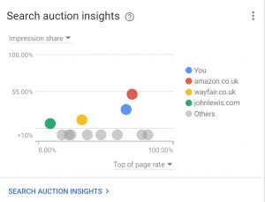
| Auction insights graph – with your position versus major competitors, plotted for impression share versus top of the page rate | Devices – bar graph split by three devices with data for costs, impressions and clicks
|
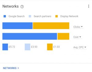
| Networks – bar graphs split by network with data for clicks, costs, and average CPC
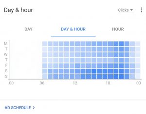
| Day and hour – plotted as tiles with color coding for 16 different metrics (pick one from a drop-down list) |
Comparison of the old and new dashboard (for the keyword tab)
In the two screenshots below, we have compared the features and marked the same features in each version of the dashboard (using color-coding). The old dashboard uses a lot of text links, while the new dashboard relies on more graphical icons or symbols.
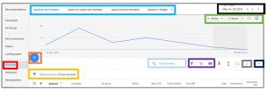
From this comparison, you can see that some of the functionality does not seem to appear in the new screen (e.g. the Edit button). However, once you select (or tick) keyphrases, then additional options appear in the form of a blue action bar:
Methods to display data to aid analysis
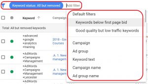
Use of filters is similar functionality to the old dashboard and can be found using the funnel symbol. There are now over 100 metrics to filter.
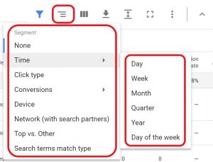
Use of segments and dimensions combines the segment and dimensions tab functionality in one place and can be found using the bar chart symbol.
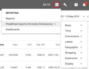
The Dimension tab appears to have disappeared from the dashboard, but it is hidden within the reports icon at the top right of the dashboard – as a ‘Predefined report’.
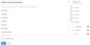
Use of standard and customized column has similar functionality to the old dashboard and can be found using the 3 vertical columns symbol. Although there are over 100 metrics to choose from, not all have been copied over from the old dashboard.![]()
More features within the main display panel
The remaining symbols are as follows:
- The down arrow is the symbol for downloading your data and is the same as the old interface
- The two lines with an arrow compresses the rows
- The square sign allows you to toggle between a full screen of data or having the side menus visible
- The symbol with three dots has additional useful features that vary depending on which tab you are on. This hides some of the time-saving features of the old dashboard, such as automated rules, diagnose keywords and the new notes panel. These are described in more detail below
- The final symbol is an arrow that allows you to show or hide the graph.
More features (three-dot symbol)
On the campaign and ad group tabs
On the keyword tab
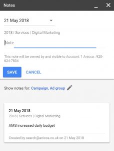
Notes (for whole account, campaigns and ad groups)
This is a new functionality only available in the new dashboard. Once you open the notes panel you can see any existing notes or create a new one.
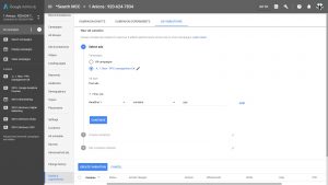
Keyword diagnosis
The first part of a test is to define the test conditions (language, location and device), which is the same as the old dashboard.
The second part is new and allows you to define the format of the file for your results. This is also different in that the results can be saved and are not live in the dashboard.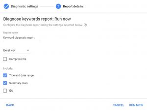
In the old dashboard you could filter the results as shown below:
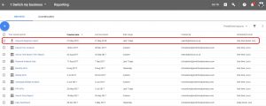
The downloaded report can be found in the reports tab (using the small graph symbol in the top right corner).
Below is an example of a downloaded Diagnosis report with examples of different keyword status.
Creating and making changes
Editing
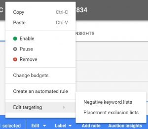
The Editing function on each of the main tabs has changed quite a lot. The biggest difference is the need to select a row before the edit function will show (as a new blue bar) and the removal of bulk editing functionality.
If you want to copy and paste individual elements (like a keyword or ad), you will need to select the individual row and the new blue edit bar will appear allowing you to edit. You can click paste from here and then go to the campaign or ad group where you wish to paste the items. There is a paste option in the more menu (with three dots).
Comparison of the editing functionality between the old and new interface
| Old dashboard | New dashboard | |
| Campaign tab
|  |  |
| Ad group tab |  |  |
| Keyword tab |  | 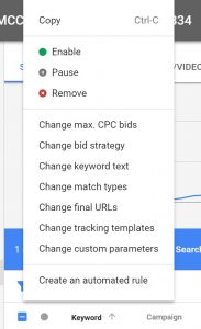 |
| Ads tab | 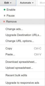 | 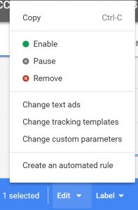 |
Bulk editing
The bulk editing facility is no longer within the Edit functionality on the main pages (see old versus new screen shots above). There is now a separate section in the main heading called Bulk actions (see the next section).
In addition to the bulk action area in the main header, it is also possible to upload a sheet for editing by pressing the symbol with three dots, when on the other tabs (i.e. the campaign, ad group, keyword and ads tabs).
 |  |
Bulk actions (replaces Bulk operations)
The previous interface had a Bulk operation section, which was found in the left-hand sidebar beneath the shared library. This had four operations (see below).
‘Bulk actions’ is the name for this functionality within the new interface. It currently has three operations; Rules, Scripts and Uploads. There have been a couple of changes in the new version:
- The Bulk edits screen is no longer available – this screen used to show a log of any bulk edits that had been made in other areas of the account; for example, a bid change across multiple keywords
- Uploads replaces some of the bulk editing functionality.
Rules
The Rules screen will show a log of all the Rules that are currently active, who created the rule, the frequency that they run and any scheduled emails. It is also possible to create new rules from this screen.
There are currently 12 Rules categories and each typically has four to six types of rules (such as pause, enable, send email, change bids). You can see some examples in the table below.
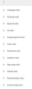 | Examples of Rule categories |
 | |
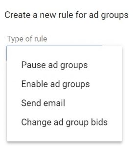 | |
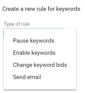 |
Scripts
Scripts can be used to automate a range of tasks. By clicking on the Scripts feature, you can see any scripts that you are currently running, or you can create a new one.
Scripts require a working knowledge of JavaScript and should not be added to automate your account without some prior research or training. However, you will not necessarily need to create a script from scratch, as you can find free scripts at sites like Free AdWord Scripts, or reviews of scripts.
In addition, many PPC management tools (such as Optymzr.com) provide a range of free scripts as part of their monthly package.
Uploads
Uploads can be accessed from the individual tabs by selecting the three dots or from the Bulk Action menu in the top.
The old and new screens are shown below:
| Old |  |
| New (from top menu) |  |
| New download template | 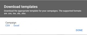 |
| Excel template example |
Drafts, experiments and new ad variants
The drafts and experiments functionality are like the old feature, which was previously in the left-hand menu bar above the shared library.
Drafts can be used to create test versions of campaigns before putting them live. Experiments can be used to test changes on a proportion of the traffic, for example a new ad or bidding option.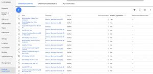
In addition to these legacy features, there is a new functionality called Ad variations, which is only available in the new interface. This is designed to test new elements of ad and apply across your whole account or selected campaigns. This makes ad testing much easier.
The Recommendations Tab: using Google to identify Opportunities and changes
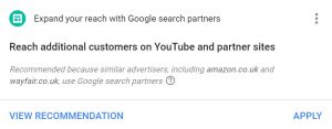
The Recommendations tab replaces the old opportunities feature, but there have been additional cards that have been added.
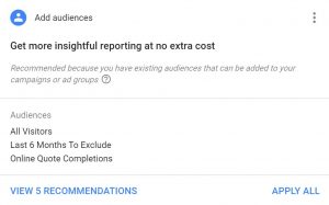
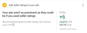
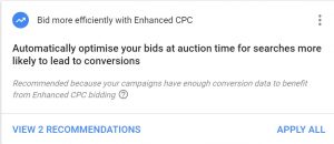
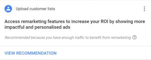
There are around 20 recommendations at the account level and even more at the MCC level. These are divided into different categories:
Account level
MCC level
Examples of Recommendations
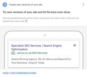 | 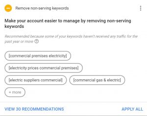 |
 |  |
 |  |
 |  |
Conclusions
The new AdWords interface has many features that can help users save time when managing their PPC account. Some of these are completely new and not available in the old dashboard.
As the old dashboard will be retired by the end of 2018, it may be worth implementing the new dashboard as soon as possible, in order to benefit from these many new features.

